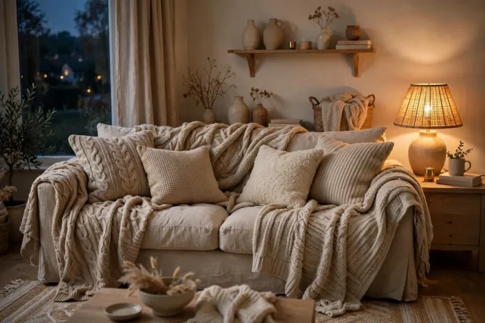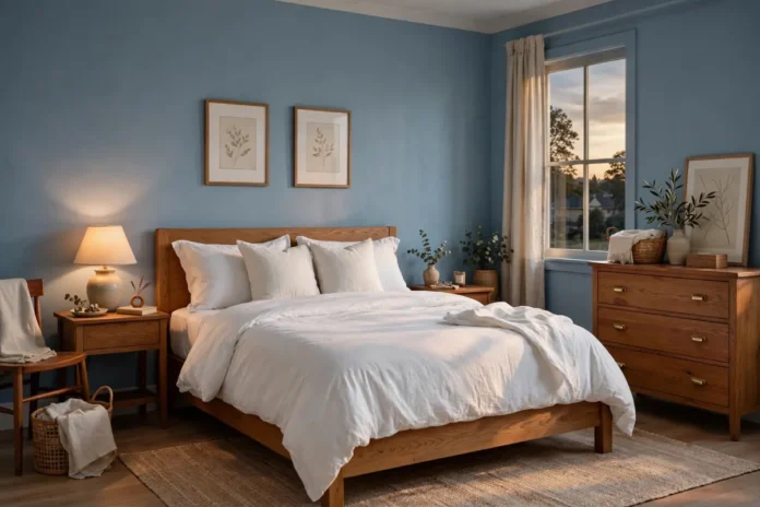
Of all the rooms in the house, the bedroom is the one where paint colour does the most quiet work. The right bedroom paint colors will not fix a noisy street or an uncomfortable mattress, but they can lower the visual temperature of the room — making it feel cooler, dimmer and calmer the moment you walk in, which is exactly the direction a sleep space should lean.
Colour psychologists and interior designers tend to agree on the broad strokes: muted, grey-leaning shades feel restful, while bright, saturated ones feel stimulating. This guide covers the colour families that suit sleep best, how light and finish change them, and how to test a shade properly before you commit a whole room to it.
Why Muted Colours Feel More Restful
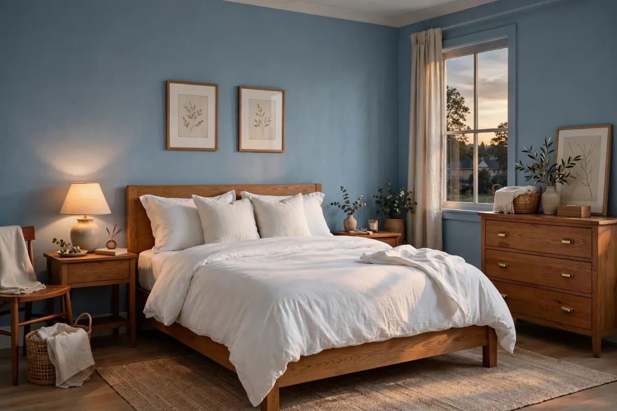
Two properties decide how a colour behaves at bedtime. The first is saturation — how pure or greyed-down the colour is. A dusty blue and a bright cobalt are the same hue family, but the dusty version asks far less of your eyes. The second is Light Reflectance Value (LRV): pale colours bounce lamplight around the room, while deeper colours absorb it and make the room feel cocooned and darker earlier in the evening.
Neither direction is automatically right. Light sleepers in bright, south-facing rooms often rest better in mid-tone or deep colours that swallow stray light. People who wake early and want a bright morning may prefer pale colours that glow at sunrise. What matters is choosing deliberately, with your own light and routine in mind, rather than copying a photograph taken in a different house.
The Best Colour Families for Sleep
- Soft and dusty blues. Blue is the classic bedroom choice, associated with sky and water. Look at grey-leaning shades in the family of Farrow & Ball Light Blue or Benjamin Moore Palladian Blue. Blue reads cool, which suits bedrooms because sleeping bodies generally prefer a slightly cool room.
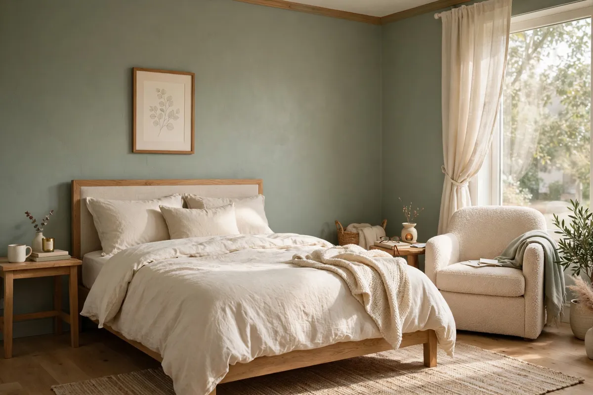
- Muted sage and eucalyptus greens. Greens in the range of Farrow & Ball French Gray or Behr’s Evergreen Fog feel botanical and settled, and they pair beautifully with oak, linen and cream. Green is also the easiest colour to carry into an adjoining bathroom for a calm, continuous feel.
- Warm neutrals and greige. If saturated colour is not your taste, warm off-whites and greiges — Benjamin Moore Swiss Coffee or Edgecomb Gray — create a soft, hotel-like backdrop that lets bedding carry the colour. Keep them warm; blue-grey neutrals can feel chilly at night.
- Dusty lavender and mauve. Used in their greyest forms, these are gentle, grown-up alternatives to pink, and they sit well with both warm metals and dark wood.
- Deep cocoon colours. Charcoal, ink navy and forest green in a matte finish can make a bedroom feel like a den — especially effective in a large or high-ceilinged room that otherwise feels exposed. Contrast with pale bedding so the bed itself reads as the bright, inviting centre.
Scale changes little about these families. A generously sized primary suite — the kind in Shaquille O’Neal’s former Florida mansion, where the suite alone covers roughly 900 square feet — still relies on the same muted, light-absorbing logic; it just has more wall to cover.
Colours to Use With Care
Bright, clean whites with high LRV can glare under lamps and feel clinical in the evening; if you love white, choose a warm, creamy version and keep light bulbs at 2700K. Saturated reds, oranges and bright yellows are energising — wonderful in a kitchen or playroom, restless on four bedroom walls. If you love them, use them in artwork, a throw or cushions that can leave the room, not in the paint. Very cool blue-greys deserve a test, too: in north-facing light they can turn icy and make a bedroom feel more like an office.
None of this means your bedroom must be beige. It means the largest surface in the room should sit in the muted half of whatever family you choose — a rule that applies at the other end of the house as well, where timeless kitchen color ideas follow the same discipline of keeping permanent surfaces calm and accents changeable.
Finish, Ceilings and the Fifth Wall
For sleep, matte and eggshell finishes beat satin and gloss. A flat finish absorbs light instead of throwing reflections around the room at lamp-lighting time, and it hides minor wall imperfections. In practice, washable matte paints now clean up well enough for most bedrooms, so you no longer have to trade calm for durability.
Do not forget the ceiling — the surface you actually look at in bed. Painting it the same colour as the walls, or one shade lighter, wraps the room and removes the hard white line that draws the eye. In deep-colour rooms, a same-colour ceiling makes the cocoon complete; in pale rooms, a soft warm white ceiling keeps things airy. Painting all five surfaces one muted colour is sometimes called colour-drenching, and bedrooms are its best use case.
How to Test a Bedroom Colour Properly
- Paint big swatches. Brush two coats onto A3-sized boards, not tiny chips, and move the boards around the room.
- Check at three times. Morning, afternoon and — most importantly — under your actual evening lamp light, since that is when the colour does its real work.
- Live with the bedding. Hold your duvet cover and pillowcases against the swatch; a shade that fights your bedding will annoy you nightly.
- Test the dark option. Even if you expect to go pale, try one deeper swatch. Many people discover the cocoon effect suits their sleep better than they predicted.
If the bedroom has an ensuite, think of the two rooms as one wind-down sequence. Carrying the same muted family through both — echoing the palette in a spa-like bathroom design — makes the evening routine feel continuous rather than jarring.
FAQ
What is the best paint colour for sleep?
Muted, grey-leaning colours are the most widely recommended — especially dusty blues and sage greens. They are easy on the eyes under lamplight and feel naturally cool and calm. The best choice is always the muted shade that suits your room’s light and your own taste.
Is a dark bedroom better for sleeping?
It can be, particularly if your room gets early-morning sun or street light. Deep matte colours absorb light and make the room feel darker and more enclosed. Balance them with pale bedding and good bedside lighting for reading.
What finish should bedroom paint be?
Matte or eggshell. Low-sheen finishes soften light and hide imperfections, which suits a restful room. Modern washable mattes are durable enough for most bedrooms.
Should the ceiling match the walls in a bedroom?
It is a good option. A ceiling the same colour or one shade lighter removes the stark contrast line above the walls and makes the room feel more enveloping — especially effective with deeper colours.
Think of bedroom paint as the background to rest rather than a design statement. Choose a muted family you genuinely like, keep the finish flat, test it under lamplight, and let the bedding and art supply the personality. The room will feel calmer tonight — and the colour will still feel right years from now.